galaxyBETA
explore
· ·
log in

log me in

log in forgot password

don't have an account?

sign up

Universe Explore

Thumbnail

developed by

developed by HappyDrifter

favorites

completed

71 ratings

rated 2.7 stars, 71 ratings.
idleresource-managementlong-termtext-basedsingle-player

Posted October 25, 2025. Updated November 7, 2025. Played 5718 times for a total of 6487 hours.

description


Universe Explore s early content adopted from Sparticle999's Space Company.

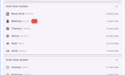
The UI has been redesigned for mobile devices, with an interface and controls optimized for smaller screens and touch interactions. Beyond the familiar beginnings, the game greatly expands the late-game experience — introducing new level of machines,interstellar fleets, artifacts, and long-term progression systems that keep the journey engaging well into the cosmic endgame.

discord

latest update


Supporting dark mode 0.5.16 November 7, 2025

Dark mode is now supported.

view all updates

similar games

newest comments


Termt November 9, 2025
+2comment score: 2

Something is unclear or incorrect about dark matter gain.
"Each achievement tier rewards 2 dark matter"
Well, since I bothered getting a load of extra achievements without my possible dark matter increasing that doesn't seem right. Maybe they mean achievement level?
Also, I could swear there was something that allowed you to turn your power into resources... haven't managed to find it in this version.

aKasimyr November 7, 2025
+1comment score: 1

Seems I'm going against the grain here lol, but having played both, I honestly prefer this UI, at least on a functional level, to the Space Company UI. This isn't nearly as pretty, (I'm exclusively PC and not typically a fan of mobile-style UIs, but this is built for that so I can't complain) but it functions better (hyperlinks yay), and has a better overview of resources (personal preference, likely), and has less odd UI text size/placement/empty prime space. I will say that this has very little personality or charm, both in the visual sense and in the gameplay sense, but I do find it far more tolerable to actually play. Still looking forward to the PC UI though!

The description does make me think of how modern (almost all?) MMOs fail, though-- it doesn't matter how good your late-game is if you can't keep people hooked long enough to get to said late-game. I do think this would benefit from some early-game balance/tweaking, and some personality, that sets it more apart from existing games and makes people want to get to this mythical wonderful late-game. It does sound like the early/mid balance is at least on the dev's radar though, so I imagine that will improve with time!

Unfortunately, I left the game one day with a positive energy inflow & stable resources (no negatives), and after closing the game and returning the next day, I somehow had -5000 energy flow. Since there doesn't seem to be a way to turn off any machines (unless there's something I'm missing), I'll have to destroy most of my machines and spend hours rebuilding them and just... hope this doesn't happen again? Regardless, even considering this and the early-mid game balance issues, I was having a lot of fun with this until then! I will likely return after a few more updates, and start over if I can't manage to fix my situation. I hope development continues!

Also, thanks for adding dark mode!

XiaoBaiMalz November 6, 2025
+3comment score: 3

Looks like a straight copy of space company, Plays like Space Company, Has the same UI as Space Company, Has the same research/Tech/Space stuff, therefore this is just space company lol

Elohim November 1, 2025
+4comment score: 4

The UI makes this impossible to enjoy for me

Akami October 29, 2025
+2comment score: 2

Isn't this just Deep Void Gate just worse UI? I mean all the mechanics are the same.

top comments


AlphaBravo October 28, 2025
+18comment score: 18

This looks and feels like a clone of Space Company.

thrawn October 28, 2025
+7comment score: 7

Please add a dark mode or compatibility with dark mode extensions.

turkwise October 29, 2025
+6comment score: 6

The UI makes me feel like I'm about to take a survey.

eyerhymes October 28, 2025
+6comment score: 6

I really like this style of game, but I can already tell the UX is going to put me off. Want to buy your next iron miner but it costs more wood than you have? Simply click back, click wood, click upgrade storage, click back, click iron, scroll down, click build. Clickable elements that move often in response to game updates are frustrating. Everything being nested in layers of tabs is frustrating. I can only imagine how it will scale up as the number of resources and actions grow.

developer response: Thanks for your detailed comment. You can click on Wood directly from the Iron page to operate on it, and the same applies to other resources. I agree the UI feels a bit awkward on PC screens, as it was mainly optimized for smaller displays. Currently the focus is on late game content. We’ll be developing a dedicated UI for desktop screens later on.

Jellssssss October 29, 2025
+4comment score: 4

The balance is really quickly time-wall-y, especially with prices increasing so so so much faster than resource gain, with almost no multipliers in sight. Can be a lot of fun with a Dark Mode, the ability to switch between resources faster, maybe a split list of all the resources on pc, that you can choose to expand instead of clicking in and out to upgrade or purchase things, and a couple of balance updates. Great start!

developer response: Thanks for your detailed suggestions. Dark mode and a PC-specific UI will be the next main focus. Resource growth does ramp up quite sharply at the start, this was designed with late-game balance in mind, but there’s definitely room to refine the early-game experience, and I’ll keep working on that. Hopefully, the offline rewards help even things out a bit.

read all comments